
Exploring Chicago Crime and Housing Price Data
by Harold Li
Note from the bloggers: Barbara and I started DataBucket last year as a platform for us to explore our interest in data science. Our goal was to answer any questions that interested us - at first, it was sports analytics, then it was about food safety and restaurants, and then it was about startups and social media, and we also touched on the financial markets.
However, upon reviewing and reflecting on our DataBucket content in 2015, we realized that we were too focused on publishing popular content, rather than delving into projects that would enhance our data science toolkit.
Thus, we will be publishing less in 2016, and will be focusing on longer term projects. Our blog posts will appear much more explanatory rather than trying to prove a point, as we want to document our progress throughout our year.
This post on Chicago crime rates and housing price data is the first of a series of projects we plan to tackle in 2016. Please feel free to give feedback or provide any suggestions on further analysis.
I've always been interested in learning more about the relationship between crime rates and housing prices. When I was growing up, I would always hear my mother talking to other aunties, saying something like, "Yeah we moved here because it was a safer neighborhood. It's more expensive though but it's worth it." When I moved into the city, my fellow peers would always compare rent to how safe the area is. They would say, "Yeah, it's cheaper there, but the area is kinda sketchy."
Thus, I wanted to take a deeper dive into exploring the relationship between living costs and crime. To explore this relationship, I needed to find robust datasets for both metrics. The Zillow API had some promising housing data, but the Trulia API provided weekly averages and metrics of listed housing prices in each neighborhood. In terms of crime rates, New York City did not have detailed data on crimes. However, Chicago's Open Source platform has a massive dataset detailing all crimes that have occurred in the 21st Century. With these datasets, I decided to focus on Chicago and to answer three questions about the city:
1) How do we best quantify the relationship between crime rates and housing prices in Chicago?
2) Do increases or decreases in crime activity affect housing prices in Chicago?
3) How do crime rates in Chicago vary at different times of the week?
Cleaning the Data
We had to clean the datasets quite extensively, as the Trulia API had a list of neighborhoods of Chicago it had prices for, while the crime dataset listed only the location of each crime in longitude and latitude. Ultimately, we used Craig M. Booth's Github code to map these locations to a list of neighborhoods as defined by the Chicago Open Source portal. Unfortunately, this neighborhood list is different from the Trulia neighborhood lists, so we mapped Trulia neighborhoods to the Chicago Open Source list. See my iPython Notebook in my Github for implementation details.
Part 1: Relationship between Crime Rates and Housing Prices in Chicago
With clean data in hand, we were able to count the number of crimes that occurred between 2012-2015 for each neighborhood and divide by its population to get a crime rate (i.e. the number of crimes an average person would commit in the past 4 years). We also averaged all the price listings for each neighborhood for that period of time to get an average housing price for each neighborhood. The following graphs that data, with the size of the data points representing the average number of house listings per neighborhood:

The best fit to this relationship was in fact a lasso regression, a form of regularized regression that puts constraints on the number of explanatory variables used in order to reduce bias. The best predictors for crime rates ended up being the inverse of price (1/Price) and the inverse of the squared price (1/Price^2). As a result, we conclude that there is a fairly strong inverse relationship between housing prices and crime rates.
The clear outlier to this relationship is the Loop neighborhood, Chicago's core business center. It has the 3rd highest housing prices, but the 6th highest crime rate. Why is it such an anomaly? The best answer may lie in our use of population to calculate the crime rate. The loop's official population is around 30,000 but far more people commute to this area every day. As crime rate is the ratio between number of crimes and residential population, the Loop's crime ratio is thus skewed upwards.
Part 2: Do Changes in Crime Activity Affect Housing Prices?
With historical data on crimes and housing prices dating back in 2012, we can trace how crime activity has changed in each neighborhood over time and whether we've seen correlated changes in housing prices as well. I would imagine that macroeconomic factors such as inflation, supply and demand, employment figures would play a larger role, but I would also argue that crime rates may also be a good indicator of the housing market.
Some neighborhoods have higher housing prices or higher crime rates, so their changes would appear greater.
To compare apples to apples, a neighborhood's crime and price changes over a period of time is measured relative to the neighborhood's median change over the last 4 years (2012-2015).
(Note: We also decided to remove Fuller Park data from this part of the analysis, as the community's average housing price is less than $100k and have less than 10 houses listed every week. We feel that the sample size is too small in this case, and it has resulted in data that is in a far different scale than all of the other neighborhoods)
This is the result we get by plotting 4-week changes in housing prices and crime rates from 2012-2015 - a widely scattered map showcasing no relationship at all:

The regression fit in this line in fact showed that a 1% change in crime activity would result in a -0.0027% change in housing prices. Or in other words, if crime activity doubles, we should expect house prices to change by a mere -0.27%. That doesn't say much at all, so we conclude that changes in crime rates are not a good predictor of house price fluctuations.
Part 3: Crime Activity at Different Times of the Week
Other than comparing crime activity with housing prices, I thought it would be useful to leverage our clean data to visualize Chicago crime rates at different times of the week on an hourly basis. This can be very useful for the Chicago police officers who can identify places that are more dangerous during their particular work shifts. It can also help answer several common questions, such as whether it is actually more dangerous to be outside at night time (and if so, when).
Visualizing Each Neighborhood in Detail
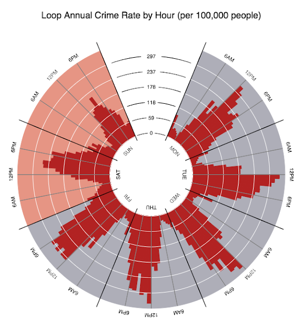
The first visualization presents the annual crime rates of a particular neighborhood in a per-hour basis. In other words, it represents the number of crimes that would occur if 100,000 people were in that neighborhood at that particular hour of the week.
(Note: click this link to choose the neighborhood you want to look at - I wasn't able to embed the interactive graphic into my blog post so I showed screenshots instead)
We can definitely see some interesting trends here - in almost every neighborhood, the safest time of the day is in fact in the early mornings, usually the time when children are going to school, but most dangerous in the late afternoons and early evenings when people are coming home from work. The Belmont Cragin township, shown below, is resemblant of a typical Chicago neighborhood.
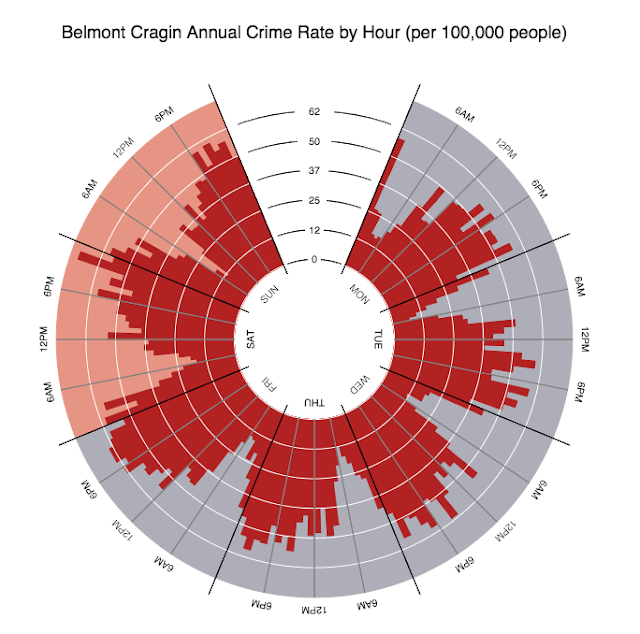
Some notable exceptions include, once again, the Chicago Loop, which is a commercial, non-residential area that only houses people in the day time. Note that the times of the week where crimes are most prevalent is during the middle of the day rather than during times when people travel back home. It also makes sense that crime rates on weekdays (shaded in gray) are lower than crime rates on weekends (shaded in orange) as very few people work on weekdays. With less crowds, theft, assaults and various violations would occur less often.
Another interesting neighborhood to look at is Lake View, a part of the city known for its nightlife. As seen in the graphic below, crime rates are fairly consistent during the weekdays, but spike up during Friday nights and Saturday nights. This is no surprise, as intoxicated people do have the tendency to warrant more attention from the police.

Visualizing Chicago as a Whole
Another way of looking at this data is to look at the entire Chicago for a given hour of the week, and seeing which parts of the city is most dangerous as various times. The following graphic showcases the crime rates in Chicago on Wednesday 8 am. This is usually at a time where most neighborhoods have the lowest amount of crime activity, so it's not surprising that O'Hare International Airport (at the top left) has the highest crime rate in Chicago - it is indeed one of the busier times of the day for the transportation hub.

Chicago Crime Rates at Wednesday 8 am
Fast forward to noon time in Chicago, and it's the commercial center - the Loop - that has the highest crime activity. Again, not surprising since this is where the crowds are at this time of the day.

Chicago Crime Rates at Wednesday Noon
In the evening, it appears that Garfield Park is the dangerous area in Chicago. Again this seems intuitive as this area is known to have violent crimes and dusk is usually when illegal activity occurs.

Chicago Crime Rates at Wednesday 7 pm
Finally, into the late hours of the night, we notice that Garfield Park remains one of the least safe places to be, but Englewood also skyrockets to the top. Again, this is expected, as Wikipedia calls it "one of the most dangerous neighborhoods in the city by almost every metric."

Chicago Crime Rates at Thursday 2 am
(Note: click on this link to choose the time of the week you want to look at - again, I wasn't able to embed the interactive graphic into my blog post so I showed screenshots instead).
Reflections
If I had more time: I would have:
1) Figured out a way to embed my interactive graphic into this post;
2) Done the same visualizations for serious crimes only - it wouldn't require much work other than deciding which of the crime types listed in the Chicago crime dataset are actually very serious offenses;
3) Incorporate macroeconomic factors (e.g. inflation, demographics of community) into predicting crime rates - I wouldn't be surprised if these additions would explain crime activity better.
So there you have it - my project on Chicago's crime and housing data. To see the details of my analysis, check out the iPython Notebook in my Github. Would love to get your feedback and suggestions on more analyses that I can dig into.
Acknowledgments:
I drew inspiration from Bokeh's gallery of sample visualizations and adapted code from their example libraries.

