Making New York Bus Time Predictions Better
Predicting bus time arrivals is by no means an easy task. It depends on a lot of factors - time of the day, traffic, the number of passengers getting on and off, weather, proximity of other buses.
Thankfully, the MTA has an app called the MTA Bus Time App that does a great job providing time estimates for all routes. But how accurate are these estimates? Is there a systematic error to these predictions (i.e. the times are consistently overestimated)? How certain can we be on these predictions (i.e. can we quantify the distribution of bus time arrivals)? These are questions that I seek to answer in this project.
Getting the Data
The MTA has a well-documented API that allows a user to obtain information on any bus line in real time. The positions of all the buses are updated every 30 seconds, and each bus has detailed information on its route, the distance remaining to each stop, and the predicted arrival time at each future station at that point in time. This provides a strong basis for us to evaluate the accuracy of these predictions, as long as we are able to detect when the bus actually arrives at that station. This detection required us to make certain assumptions, such as classifying a bus as having arrived at the station when it is within 50 meters of the destination.
Visualizing the Data

We managed to obtain arrival estimates and actual arrival times for all the bus lines for an entire 24-hour period on February 23rd, 2016, and visualize the data in the hairline chart below. Here, we plot the difference between predicted and actual arrival time (i.e. lateness) with the travel distance corresponding to that estimate. Each hairline represents a particular bus arriving at a particular bus stop and tracks how its prediction accuracy varies as it approaches the bus stop. We can point out a few observations from this visualization:
First, a lot of these hairlines are very spiky.
This actually is a good sign as it demonstrates that MTA Bus Time updates their prediction times as new information comes in. For instance, if the lateness is 10 minutes at 5000 meters, but only 2 minutes at 4900 meters - it likely means that the bus encountered traffic conditions at 5000 meters and was therefore delayed. MTA Bus Time updated their prediction time to reflect the delay. As a result, the bus is significantly less "late" for the remainder of the trip.
Second, Travel times do become more volatile as the distance from the bus stop increases.
This makes sense as buses will be exposed to more traffic, weather and unforeseen circumstances in longer distances. Although there seems to be less variance for really long distances, this is likely due to a smaller sample size.
There are obviously less situations where we can trace predictions back through further distances.
Third, buses on average arrive later than their predicted arrival times
, as shown by the positively sloped line on the graph. This is to be expected, as a bus can only be earlier by a small amount, as opposed to a comparatively larger amount if it were late. That said, it is definitely something we can exploit to make more realistic predictions.
Finally, I find it very surprising that there is not a larger upward skew in these graphs.
I've had multiple experiences on the bus where it takes over 30 minutes to go crosstown given the amount of traffic in busy areas such as Times Square and Grand Central. However, from what we can see, the variance above and below the mean seems quite symmetric.
Modeling the Bus Time Prediction Data
Upon looking at the hairline charts, there appears to be some evidence that all of these bus paths can be modeled as a Wiener process. A Wiener process is defined as a stochastic process with independent, Gaussian increments. Instead of time increments, which the Wiener process is commonly used for, our proposed Wiener process here will be distance increments, and there will be a drift as the process progresses through larger distances.
(Some may find this categorization counterintuitive, since buses are meant to travel closer to the stop, not away from it. Thus, it can be argued that the Wiener process should have distance increments measured in the opposite direction. However, a time-inverted Wiener process is still in fact a Wiener process, which justifies our use of the model in this context.)
The following graph showcases the standard deviations among the hairlines at different distances from the bus stop. A Wiener process should show standard deviations that follow a square-root like shape and these graphs definitely shows such behavior. Note that the standard deviations at very large distances tend to decrease, but that, we believe, are largely due to a small sample size.


However, to satisfy the Wiener process, we also need to show that the processes have independent increments. The following graphs compare consecutive increments (the earlier increment on the x-axis and the later increment on the y-axis).


We can definitely see some significant negative correlation here (-33% and -37% for the M5 and M11 lines respectively). Upon reflection, this makes sense because the bus time app definitely seeks to recalibrate after receiving new information, which tends to revert lateness back closer towards the zero-minute mark. As a result, we cannot treat these hairlines as Wiener processes. That said, we can still model the distribution of lateness at a given distance as a Gaussian process, where the mean lateness is proportional to the distance and the standard deviation lateness is proportion to the square root of the distance.
Analyzing Bus Time Prediction Performance at Different Times of the Day
By calibrating these results to a Gaussian process, we can try to examine how bus time prediction performance varies at different times of the day. To conduct this analyses, I split the day into 5 distinct periods: 1) Early Morning (12 am - 4:30 am), 2) Morning Rush Hour (4:30 am - 10:30 am), 3) Midday (10:30 am - 3 pm), 4) Evening Rush Hour (3 pm - 9 pm), and 5) Late Evening (9 pm - Midnight).
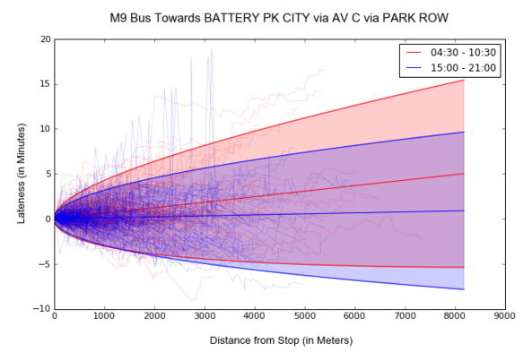
The most interesting comparison is between the morning and evening rush hours, as both are in busy traffic periods, and we see that there are some quite noticeable differences for particular bus lines. For instance, the southbound M9 bus is significantly more late in morning rush hour (around 36 seconds late per kilometer) compared to in evening rush hour around (6 seconds late per kilometer). That means a bus that is around 15-20 blocks away will arrive 1 minute later during the morning compared to the evening, which is pretty significant.
Another example is the Upper East Side bound M31 bus. This time, we see that the morning rush hour buses are more on time than evening rush hour buses. Furthermore, there's more variance in arrival times for evening buses, which may suggest that it is more prone to volatile traffic conditions during that period of time.

Finally, the graph below describes the overall distribution of bus arrivals lateness by the time of the day. Overall, across all bus lines, the morning rush hour buses tend to more late compared to evening rush hour buses, as seen in the graph below. We also see that, as expected, early morning and late evening buses tend to be the least late and have the strongest variance, most likely due to less traffic in the NYC area, and that midday buses tend to perform somewhere in between rush hour and night time behavior.

Conclusion
Through this project, we have managed to clean and organize the data enough for us to understand how bus times perform relative to their predicted arrival times. In general, we have noticed that buses do have different variances and degrees of lateness at different times of the day, and that the distribution more or less follows a Gaussian pattern, with a drift that suggests that the Bus Time App usually underestimates arrival times.
One of the limitations for this project comes from the fact that all of the data must be retrieved in real time. That means that to get a whole day worth of data, I would have to run a script that retrieves data every 30 seconds for 24 hours, which not only requires a lot of error checking but also consumes a lot of memory. Although I managed to retrieve that data, it took many iterations to get it right.
If I had more time, I would further improve this project by updating the distribution of these bus arrivals in real time. This will not only create a useful application that allows passengers to see how accurate the MTA Bus Time app predictions are in real time, but also reduce the amount of memory needed to conduct this analysis. I can imagine this being a Bayesian process, where we have an existing prior distribution (which utilizes the analysis in this blog post), and new data being continuously retrieved every 30 seconds of every day that would update the posterior distribution. This is a project that I would like to pursue at some point in the future - ultimately I hope to have an app that rivals the MTA Bus Time App.